The problem with the US$1.5 trillion margin-debt chart
I love a good chart. This one hits hard. It is also doing rather more arguing than the data can support.
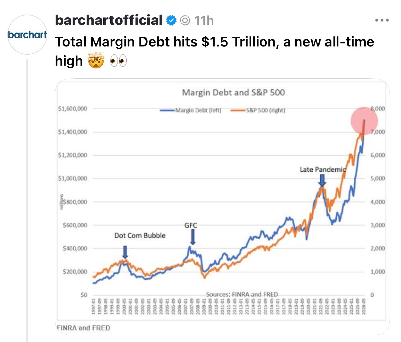
I love a good chart. This one hits hard. It is also doing rather more arguing than the data can support.
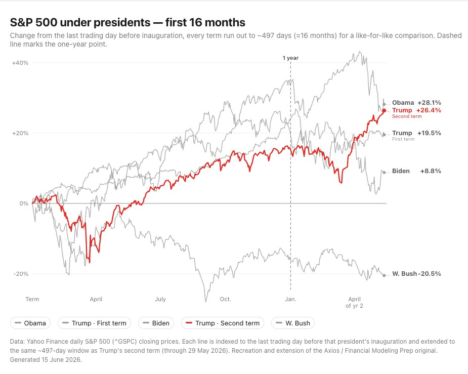 I just tasked Claude Opus 4.8 to extend a chart, first drawn by Axios, to show the comparative performance of US presidents in their term up to the equivalent of the end of May in their second year, as we have just passed that point for Trump II. The longer I looked at it the more it bothered me.