I love a good chart. This one hits hard. It is also doing rather more arguing than the data can support.
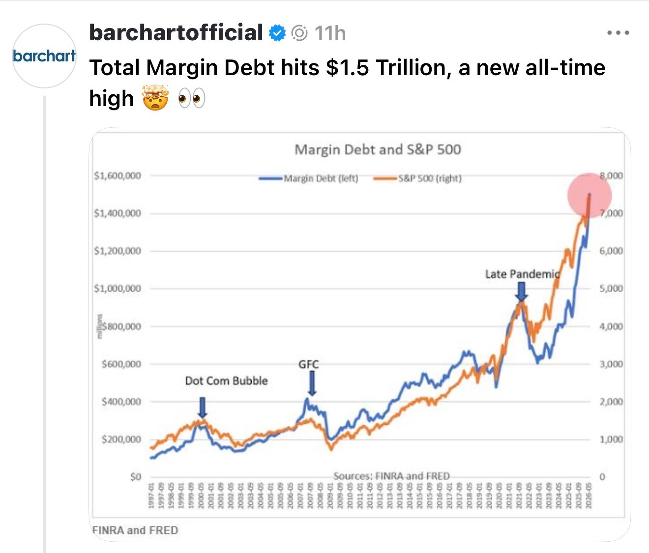
Barchart posted this chart showing US margin debt at US$1.5 trillion for the first time. The blue line turns vertical at the right-hand edge. The S&P 500 climbs alongside it. The dot-com bubble, the GFC and the post-pandemic peak are all helpfully marked as earlier moments of danger.
The message is clear: this is unprecedented and therefore alarming.
The problem is that a linear chart of a compounding dollar series always ends this way. Recent values become a cliff face. Old values become foothills.
That is not a trivial presentation choice. It changes the conclusion a reader is invited to draw.
The dot-com margin-debt peak was roughly US$280 billion. The GFC peak was roughly US$380 billion. June 2026 came in at US$1.50 trillion. On a linear axis, today dwarfs both. But the US sharemarket, the US economy and nominal asset values have all become vastly larger in the meantime.
Raw dollars are real numbers. They are not, by themselves, a useful comparison across three decades.
So I rebuilt the chart.
First, put the dollar series on a log scale
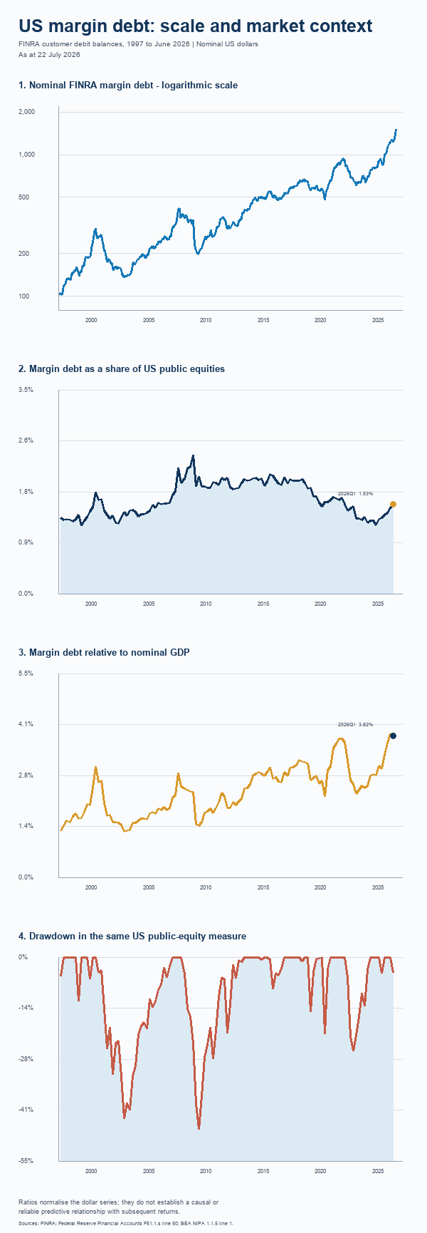
The first chart keeps the FINRA series in nominal dollars but uses a logarithmic axis.
This does not make the US$1.5 trillion figure uninteresting. It makes it interpretable. A move from US$100 billion to US$200 billion occupies the same visual distance as a move from US$500 billion to US$1 trillion because both are doublings.
The dot-com episode, the 2007 peak and the present upswing now look like what they were: substantial increases in investor borrowing from different starting points. The present level is high. It does not visually erase the history that came before it.
Then add a denominator
The more useful question is not whether margin debt is at a record in dollar terms. It almost has to be. The useful question is how large it is relative to the market that supports it.
For the second chart I used the Federal Reserve’s end-of-quarter measure of public US corporate equities - a broad, dollar-denominated market-value series. It is a better denominator than an index level because the numerator and denominator are both actual dollar amounts.
The latest fully aligned observation is 2026Q1. FINRA margin debt at the March quarter-end was US$1.221 trillion against US$79.674 trillion of public US equities, or 1.53%.
That is a very different claim from “margin debt is US$1.5 trillion”.
It is also not a clean market-wide leverage ratio. FINRA’s numerator is customer debit balances reported by member firms. The Federal Reserve denominator is a much broader measure of US public equities. The two series are not a matched balance sheet. Treat the ratio as a scale indicator, not a precise statement of how leveraged every shareholder is.
That distinction matters.
GDP is another useful, imperfect scale check
The third chart compares margin debt with nominal GDP. At 2026Q1, the aligned ratio was 3.82%.
This is not a balance-sheet measure either. Margin debt is a stock at the end of the quarter. GDP is an annualised flow. But it answers a sensible basic question: how large is this pool of borrowing relative to the economy that sits beneath it?
The answer is more informative than the headline dollar number. It is not a warning light with one obvious threshold.
Update: It’s also worth noting that this is imperfect as it compares global stocks listed on US stock markets solely against US GDP. **High Overseas Exposure: **Tech firms (Intel: 78%, Apple: 57.3%, Microsoft: ~50%) and energy companies (ExxonMobil: ~65%, Chevron: ~65%) have the highest overseas revenue shares due to global demand for semiconductors, consumer electronics, and oil. Low Overseas Exposure: Healthcare (UnitedHealth, CVS, Cigna) and U.S.-centric firms (Fannie Mae, Home Depot) derive <10-20% of revenue internationally, reflecting domestic market dominance.
The drawdown chart shows the context, not a prophecy
The fourth chart shows drawdowns in that same broad public-equity measure. It is there because the real concern about margin debt is the mechanism of a reversal.
Margin borrowing can amplify a fall. Falling prices can produce margin calls. Margin calls can force selling into a weak market. That is a mechanical feedback loop, not a spooky market superstition.
But it does not follow that a high margin-debt reading predicts the date or depth of the next correction. Markets can carry elevated leverage for a long time. Drawdowns happen for many reasons. A chart that puts the two series near one another should not quietly imply a clockwork causal relationship.
That is the broader lesson. Charts are not neutral containers for numbers. Axis choices, denominators and definitions determine what readers can see.
If a chart is going to frighten people with US$1.5 trillion, it should first show them what US$1.5 trillion means.
Chart 2 is the one that stands out for me.
Margin debt as a share of US public equities is 1.53% in 2026Q1. This is below the 2000-present quarterly average of 1.67% and median of 1.65%. It is about 0.14 percentage points, or 8.3%, below the average.
Something to watch. Nothing to be alarmed about.
Unfortunately in today’s “attention economy” having “OK” or “normal” results doesn’t yield clicks or eyeballs. Sadly that’s what seems most important now.
Sources:
- FINRA Margin Statistics (finra.org)
- Federal Reserve Financial Accounts, Table F51.1.s (federalreserve.gov)
- BEA National Income and Product Accounts, Table 1.1.5 (bea.gov)