There’s a particular kind of technological shift that’s almost impossible to explain to anyone who came after it. Not because it’s complicated, but because the world it changed has vanished so completely that the change itself becomes invisible.
I’ve been thinking about this since reading Seth Godin’s note on the Mac’s 42nd anniversary. He argues, correctly, that the famous 1984 Super Bowl ad wasn’t what saved Apple’s strange new computer. It was the people who made the Mac genuinely better: Guy Kawasaki building the developer ecosystem, Susan Kare designing the icons, the late great Bill Atkinson setting unreasonable standards for the interface. “Hype is a trap,” Seth writes. “Better is better.”
True. But there’s a chapter he left out. The chapter where “better” nearly failed because nobody could see what it was better for.
The original Mac shipped with 128 kilobytes of RAM, an amount so small that the entire operating system was smaller than a single JPEG file today. The bitmap screen seemed like an expensive gimmick. The mouse struck many as a toy. Sales surged on the strength of the initial fanfare, then collapsed when the hype faded and the specs proved inadequate.
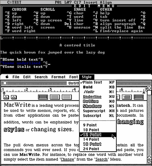
What rescued the Mac was desktop publishing. The LaserWriter. PageMaker. And the seven letters that changed everything: WYSIWYG.
What You See Is What You Get.
If you grew up after this became standard, you cannot feel what those words meant. You’ve always lived in a world where you choose a font and the screen shows you that font. Where you adjust a margin and it appears, right there, exactly as it will print. You accept this the way you accept that taps produce water. It’s not a feature. It’s just how things are.
But in 1985, seeing your document on screen (truly seeing it, with the typefaces and the spacing and the layout rendered faithfully) was a kind of magic. Before WYSIWYG, you typed blind. You formatted with codes and commands, such as in Wordstar screen shown at top. You sent your work to the printer and discovered, only then, what you had actually made.
The Mac’s bitmap display, dismissed by serious computer people as a waste of processing power, turned out to be the foundation for something no other machine could offer. The mouse, mocked as unnecessary, turned out to be essential for dragging text and positioning images. The “underpowered” 128KB machine, when upgraded to 512KB (‘the Fat Mac’), turned out to be exactly powerful enough for the application that would justify its existence.
Desktop publishing didn’t just save the Mac. It revealed what the Mac had been all along: a machine designed around human perception rather than computational efficiency. User-centred design before hardly anyone called it that.
Seth is right that hype is a trap. But here’s the uncomfortable addition: “better” can be invisible until circumstances reveal it. The Mac was better from day one. It took desktop publishing (and the near-death experience that preceded it) for anyone to see it.
Every time you choose a font and trust that it will print faithfully, you’re living in the world that rescue created. You just don’t notice anymore. That’s how complete the revolution was.